

EASEL OF Catherine Scully
Catherine Scully
Hi! I'm Cat. I've been published as a map illustrator but would love to work on improving backgrounds, people, and creatures. I'm most passionate about creatures!
I am open to critique
I WOULD LIKE HELP WITH
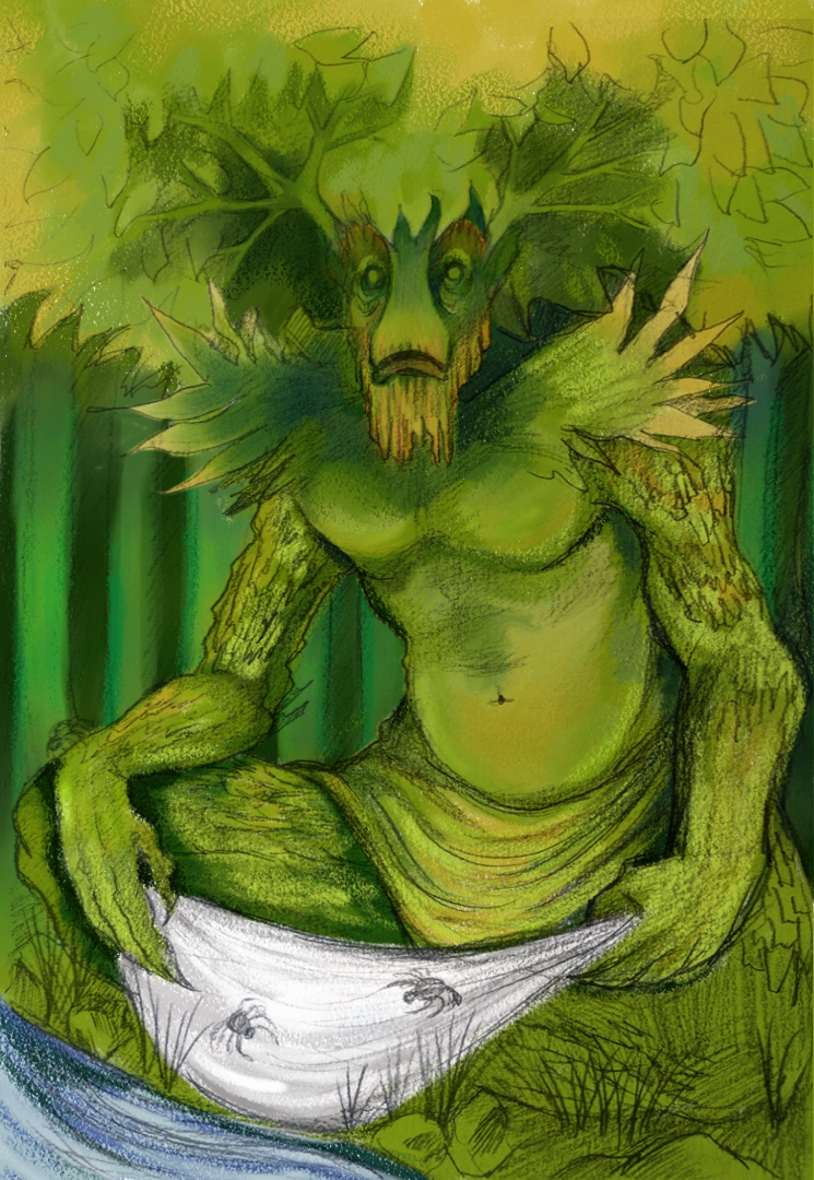
I want some help with the colors and ways to make this work dimensionally and so we're not drowning in green. I'm working in Corel Painter, which is new to me, and learning as I go. I'm more traditional but I really want to learn to get better at digital!
Hello Catherine,
I would advice incorporating some other colors on the creature as well. You can work with colder and darker colors for the background forest (blue-greens) and have a bit more warmer colors on the creature.
Before you dive straight into adding more colors though, I would have another look at your values. The face is quite readable, but the lower part is really flat. This because there are no value variations happening. Because the values are off, it’s very hard to read where the light is coming from.
I would fix that first and then maybe upload a new version? Start with adding more values that define the form of the creature and think of simple shapes that make this creature. The more you work towards the face, you can increase the contrast. (Ie. Right now, the white piece of cloth is acting as a primary focus, just because it has so much contrast to it).
Good luck!
Hey Lino! Thank you so much for your advice! I’ll definitely work on adding cool shadows into my work and defining the lower third more! Can’t wait to give this another go! Thank you!
Hey, Cat.
I like this!
I don’t think the green is the problem. It’s the value structure.
Before you start thinking about hue, first consider value (and temperature).
If you can get the composition working in just a few values, the rest is easy.
Just pick 3 different shades of green that correspond to those values correspond and you’re set.
Currently, the figure lacks a sense of form, because he lacks really discernible shadows.
Shadows = Form.
The softer and mushier your shadows are, the mushier your sense of form will be.
Define the light more.
<3
This is so helpful! Especially how your showed the shadows! Thank you so much! This was invaluable! <3 I'll give it another go!
Hey Cat!
I like this guy as well! Great concept.
I’ll just add that with the water running in the foreground, you have a really cool opportunity to throw some reflected light up into his face.
You’ve got some bounce light on his tummy – which is nice. I always appreciate a nicely lit belly. You can do that same sort of thing in the area you want to draw the viewers eye too as well. (like the face). Don’t overdo it though – not everything has to be equally “bounce lit” – think of visual heirarchy 🙂
You are an art ninja
Oh that’s a great idea! I’ll definitely add some reflective light. Thank you!!!